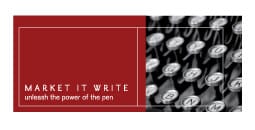
We all make mistakes. In our personal lives, in our businesses. It happens. Three years ago, I made a pretty big one with the Market it Write identity.
I chose a design firm that didn’t respect words.
You see, people have different opinions on design, content and their relative importance.
- Some—often writers—believe that content is king.
- Others care more about presentation, less about the message.
- A third group gives equal weight to both.
I’ve always fallen into the third camp. However, entrepreneurs often have a glaring blind spot when it comes to our own businesses.
Mistakes were made
After a few rounds, we settled upon an identity that looked nice, with eye-catching images and a vibrant color palette.

The Old Design
You probably see the problems already.
My friend and long-time collaborator Peter Levinson of LevinsonBlock gently pointed out a few issues:
- Market it Write creates words, which makes a wordmark more appropriate than a visual icon.
- The design downplays the company name and tagline, treating them as mere design elements.
- The logo blocks don’t translate easily to other applications, like online directories or product personalization.
Peter and I had this conversation soon after the design was finalized. The deed was done, however, and I needed to move on.
Everything changes
The design-intensive logo didn’t hurt Market it Write over the past three years. But every time we needed a new application, we had to design a custom treatment: for ads, for promotional items, etc.
The advent of social media applications created the need for a square icon to communicate our brand. The tiny letters became even tinier.
I finally cried, “Uncle.”
Working with Larissa Nycz of Tribecca Designs, we developed a new identity with the following guidelines:
- Reinforce the core service/product. As a copywriting agency, we’ve emphasized the company name with a wordmark. Visual logos also work, but the best logos have a powerful reason behind their icons. The subtle arrow in the FedEx logo, for instance, conveys motion.
- Convey brand attributes. While I love traditional, elegant fonts like Goudy and Garamond, much of our work resides online on websites and blogs. The wordmark needs to reflect our fluency with modern publishing platforms.
- Support a range of uses. Some applications require a landscape orientation. Other times, a vertical lock-up is required. The designer should create standard logos that will work in different sizes and shapes, such as the square social media icon.
Yes, Market it Write is a copywriting agency, not a design firm. But this painful and costly experience reinforced the importance of marrying message with effective design. May you reap the benefits of this hard-earned lesson.
![]()
The End Result
So what do you think of the end result? Did we achieve our goals? Please take our poll (left side of this page) if you haven’t done so already. Do you have any other design advice to share? We’d love to hear it.


Good job with your new identity, Mistina. The new wordmark is much more readable and professional and also has a stronger positive impact than the old logo, at attribute often overlooked in branding.
As an agency that I like to think balances message and visuals, I’ll suggest that the word “it” gives you something to use for the theme of a marketing campaign: “Website. Email. Brochure. Whatever your “it” is, we can write it.”
Words are powerful. Design is also powerful.
I support your decision to go with just words – but if you can add a little design in with your kit of graphics, then you’ll start to create more opportunities for people to remember you. You’ll also capture more visual learners.
As a small business, every bit of “memorability” counts!
You got me to click through. And I had a minor epiphany, too. Thanks. (At this point, any epiphany is a good one, you know. OK, maybe it was satori, not an epiphany, but it was still good.)
I totally agree, Erin. I think that both words and design work best when working together. Thanks for visiting – and for commenting!
Thanks, Howard – both for the positive feedback and for the great idea. We’ll have to try that out. Let’s discuss during our next meeting.
Thanks for clicking, Steve. And for expanding my vocabulary yet again. (Once upon a time, I thought my vocabulary was decent. I’m pretty sure that time pre-dated our acquaintance.) You can’t just drop a tiny bombshell like that and leave… Inquiring minds want to know.